
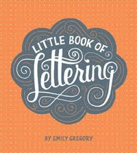


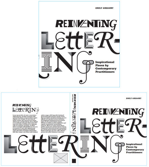
Since the brief was pretty open, and knowing that the book would be a collection of lettering and type artists, I wanted a cover that was fun representation of that collection of talent.
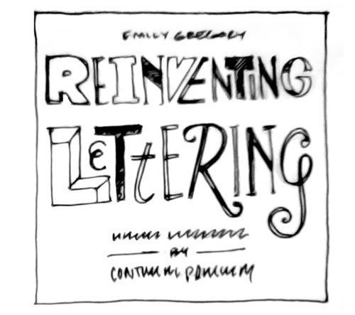
Jason's first concept sketch (above) was to reflect the melting pot of talent that was featured in the book by giving character to every letter of the title.
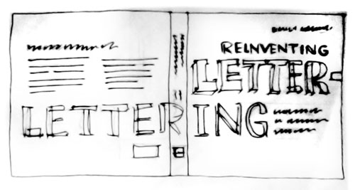
From there he thought to break up the many letters of the title across the front and back of the book and really make the title really playful. He envisaged too, that it would have a fun billboarding effect if placed on staggered shelves.
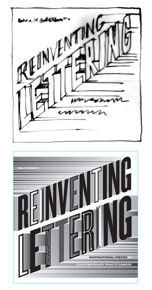
These roughs shown below are what went onto eventually become the final cover... the bold and dynamic cover that it became. First a rough sketch, then a digital black and white digital rough...
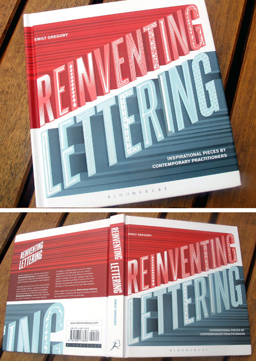
... and then with a few rounds of color versioning, texturizing, finessing and fine tuning... TAa Daaaa... there it is in all it's glory!!
Gorgeous work Jason - Thankyou ever so for spilling your creative beans!
DON'T FORGET TO ENTER TO WIN A COPY OF THE BOOK HERE
I do love a good process post! This is great!
ReplyDeletewow, great to see how it came together! I love that cover!
ReplyDelete